
StdDlgActionCardItem
Action card item node with optional arrow, checkbox, or radio button icon
Extends StdDlgItemBase
Description
The StdDlgActionCardItem is used to highlight the StdDlgItemBase child nodes in the content area of a custom dialog. This node enables developers to add a "more info" arrow icon, radio button icon, or check box icon to the items in the content area. Developers can leverage these icons to enhance the check box and radio button functionality in their custom dialogs.
The icons and the StdDlgItemBase child nodes are drawn on top of a rectangular background that is tinted using the RSGPalette's DialogFootprintColor field.
When the StdDlgActionCardItem node has focus, the icons themselves are tinted using the RSGPalette's DialogFocusItemColor field. When the node does not have focus, the icons are tinted using the DialogTextColor field.
The StdDlgActionCardItem node is designed to be focusable; therefore, it may receive key events.
Fields
| Field | Type | Default | Access Permission | Description | |||||||||||||||
|---|---|---|---|---|---|---|---|---|---|---|---|---|---|---|---|---|---|---|---|
| iconStatus | bool | false | READ_WRITE | Indicates whether the StdDlgActionCardItem node is in the checked or unchecked state when the iconType field is set to "checkbox" or "radiobutton". The icon shown for an action card is based on the value of this field. | |||||||||||||||
| iconType | string | "none" | READ_WRITE | Specifies the icon used for a StdDlgActionCardItem node. This may be one of the following values:
| |||||||||||||||
| Value | Type | Description | |||||||||||||||||
| none | string | No icon is shown. | |||||||||||||||||
| more_info | string | A right arrow icon is displayed to the right of the StdDlgActionCardItem child nodes. This icon is typically used to indicate that more information will be shown when the action card is selected. Typically, this additional content is displayed in another dialog. | |||||||||||||||||
| checkbox | string | A checkbox icon is shown to the left of the StdDlgActionCardItem child nodes.When the iconStatus field is set to "true", this adds a checkmark inside the box.When the iconStatus field is set to "false", an empty box icon is displayed. | |||||||||||||||||
| radiobutton | string | A radio button icon is shown to the left of the StdDlgActionCardItem child nodes.When the iconStatus field is set to "true", this adds a filled circle inside the box.When the iconStatus field is set to "false", an empty circle icon is displayed. |
Examples
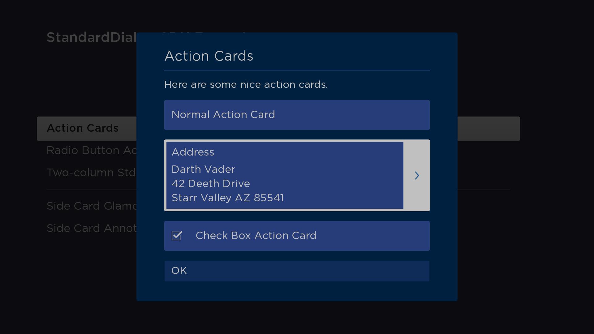
Mixed iconTypes
In this example, the dialog has a StdDlgContentArea node with a StdDlgTextItem node ("Here are some nice action cards"), and it has the following three StdDlgActionCardItem nodes (listed in order):
-
A SimpleLabel child node that displays the text "Normal Action Card". The iconType field is set to "none".
-
A LayoutGroup child node that has its layoutDirection field set to "vert" and contains four SimpleLabel nodes for displaying an address. The iconType field is set to "more_info, resulting in the display of a right arrow.
-
A SimpleLabel child node that displays the text "Check Box Action Card". The iconType field is set to "checkbox", resulting in the display of a check box.
<?xml version="1.0" encoding="utf-8" ?>
<component name="ActionCardsDialog" extends="StandardDialog" initialFocus="buttonArea">
  <script type="text/brightscript">
    <![CDATA[
      function init()
        print "Creating ActionCards"

        setUpPalette()

        m.buttonArea = m.top.findNode("buttonArea")
        m.top.observeFieldScoped("buttonFocused", "printFocusButton")
        m.top.observeFieldScoped("buttonSelected", "printSelectedButtonAndClose")
        m.top.observeFieldScoped("wasClosed", "wasClosedChanged")

        m.top.findNode("actionCardNormal").observeField("selected", "handleActionCardNormal")
        m.top.findNode("actionCardMoreInfo").observeField("selected", "handleActionCardMoreInfo")
        m.top.findNode("actionCardCheckBox").observeField("selected", "handleActionCardCheckBox")
      end function

      sub setUpPalette()
        ' set a default palette to access the DialogTextColor to use
        ' for the color of text of the SimpleLabel node's that are
        ' children of the StdDlgActionItem's
        m.top.palette = createObject("roSGNode", "RSGPalette")
        m.top.palette.colors = {
          DialogBackgroundColor: "0x002040FF",
          DialogItemColor: "0x007FEFFF",
          ' DialogTextColor: "0x007FEFFF",
          DialogTextColor: "0xC0C0C0FF",
          ' DialogFocusColor: "0x007FEFFF",
          DialogFocusColor: "0xC0C0C0FF",
          DialogFocusItemColor: "0x003E7EFF",
          DialogSecondaryTextColor: "0x007FEF66",
          DialogSecondaryItemColor: "0x807FFF4D",
          DialogInputFieldColor: "0x807FFF80",
          DialogKeyboardColor: "0x807FFF4D",
          DialogFootprintColor: "0x807FFF4D"
        }

        dialogTextColor = m.top.palette.colors["DialogTextColor"]

        ' set all SimpleLabel colors to use the palette's dialogTextColor
        m.top.findNode("noneLabel").color = dialogTextColor
        m.top.findNode("moreInfoLabel1").color = dialogTextColor
        m.top.findNode("moreInfoLabel2").color = dialogTextColor
        m.top.findNode("moreInfoLabel3").color = dialogTextColor
        m.top.findNode("moreInfoLabel4").color = dialogTextColor
        m.top.findNode("checkboxLabel").color = dialogTextColor
      end sub

      sub printFocusButton()
        print "m.buttonArea button "; m.buttonArea.getChild(m.top.buttonFocused).text; " focused"
      end sub

      sub printSelectedButtonAndClose()
        print "m.buttonArea button "; m.buttonArea.getChild(m.top.buttonSelected).text; " selected"
        m.top.close = true
      end sub

      sub wasClosedChanged()
        print "ActionCards Closed"
      end sub

      sub handleActionCardNormal()
        print "Normal Action Card Selected"
        m.top.close = true
      end sub

      sub handleActionCardMoreInfo()
        print "More Info Action Card Selected"
      end sub

      sub handleActionCardCheckBox()
        print "Check Box Action Card Selected"
        actionCard = m.top.findNode("actionCardCheckBox")
        actionCard.iconStatus = not actionCard.iconStatus
      end sub
    ]]>
  </script>

  <children>
    <StdDlgTitleArea primaryTitle="Action Cards" />
    <StdDlgContentArea>
      <StdDlgTextItem text="Here are some nice action cards." />
      <StdDlgActionCardItem id="actionCardNormal" iconType="none">
        <SimpleLabel id="noneLabel" text="Normal Action Card" />
      </StdDlgActionCardItem>
      <StdDlgActionCardItem id="actionCardMoreInfo" iconType="more_info">
        <LayoutGroup itemSpacings="[20,10]" layoutDirection="vert">
          <SimpleLabel id="moreInfoLabel1" text="Address" />
          <SimpleLabel id="moreInfoLabel2" text="Darth Vader" />
          <SimpleLabel id="moreInfoLabel3" text="42 Deeth Drive" />
          <SimpleLabel id="moreInfoLabel4" text="Starr Valley AZ 85541" />
        </LayoutGroup>
      </StdDlgActionCardItem>
      <StdDlgActionCardItem id="actionCardCheckBox" iconType="checkbox">
        <SimpleLabel id="checkboxLabel" text="Check Box Action Card" />
      </StdDlgActionCardItem>
    </StdDlgContentArea>
    <StdDlgButtonArea id="buttonArea">
      <StdDlgButton text="OK" />
    </StdDlgButtonArea>
  </children>
</component>
radiobutton iconType
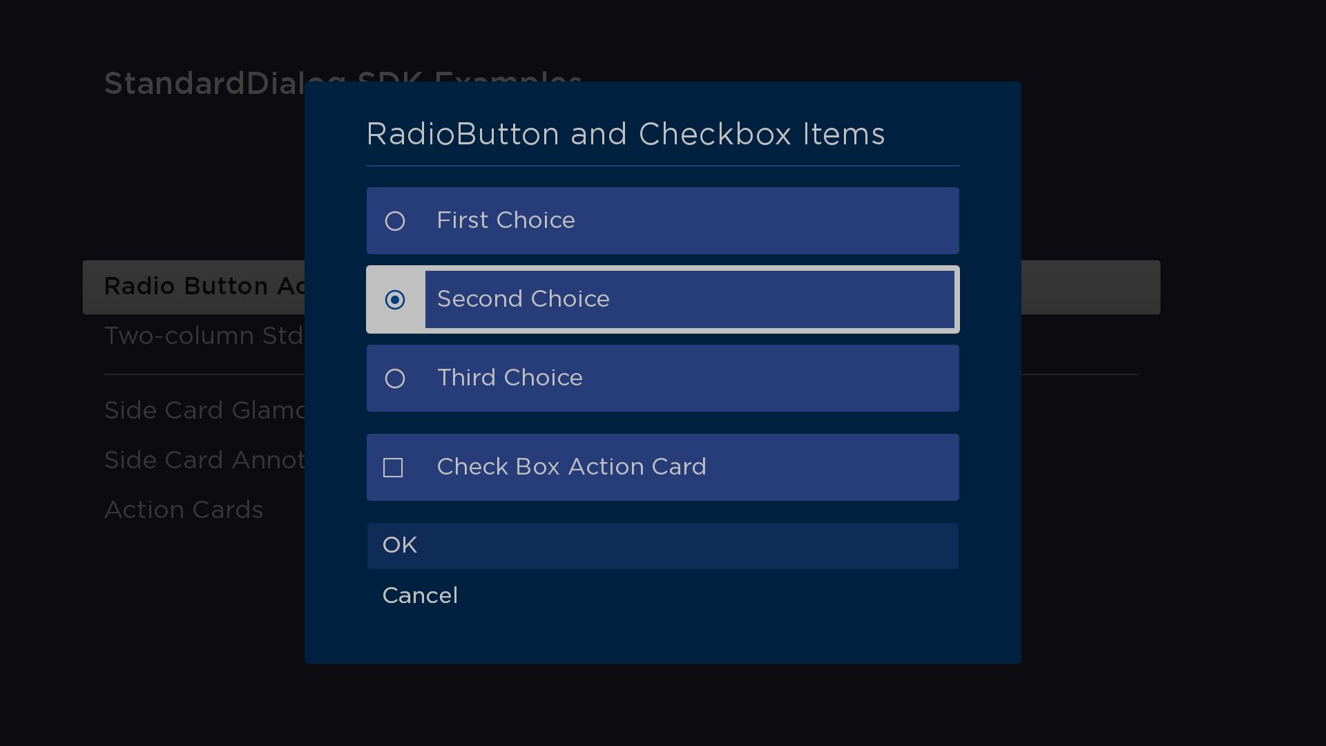
In this example, the dialog has a StdDlgContentArea node a StdDlgItemGroup node. The StdDlgItemGroup node contains three StdDlgActionCardItem nodes with their iconType field set to "radiobutton". Observe that the vertical spacing between the three StdDlgActionCardItem nodes is smaller to visually enforce that they are part of a group. Below the StdDlgItemGroup is another StdDlgActionCardItem with its iconType field set to "checkbox".
The StdDlgItemGroup node enforces the rule that when multiple items StdDlgActionCardItem nodes have their iconType field set to "radiobutton", only one may have its selected status be set to "true".
This example configures an RSGPalette node for the dialog, and then it uses the "DialogTextColor" from that palette as the colors for the SimpleLabel children of the StdDlgActionCardItem node.
<?xml version="1.0" encoding="utf-8" ?>
<component name="RadioButtonActionCardsDialog" extends="StandardDialog" initialFocus="buttonArea">
  <script type="text/brightscript">
    <![CDATA[
      function init()
        print "Creating RadioButtonActionCards"

        setUpPalette()

        m.buttonArea = m.top.findNode("buttonArea")
        m.top.observeFieldScoped("buttonFocused", "printFocusButton")
        m.top.observeFieldScoped("buttonSelected", "printSelectedButtonAndClose")
        m.top.observeFieldScoped("wasClosed", "wasClosedChanged")

        m.top.findNode("actionCardRadioButtons").observeField("itemSelected", "handleActionCardRadioButtons")
        m.top.findNode("actionCardCheckBox").observeField("selected", "handleActionCardCheckBox")
      end function

      sub setUpPalette()
        ' set a default palette to access the DialogTextColor to use
        ' for the color of text of the SimpleLabel node's that are
        ' children of the StdDlgActionItem's
        m.top.palette = createObject("roSGNode", "RSGPalette")
        m.top.palette.colors = {
          DialogBackgroundColor: "0x002040FF",
          DialogItemColor: "0x007FEFFF",
          ' DialogTextColor: "0x007FEFFF",
          DialogTextColor: "0xC0C0C0FF",
          ' DialogFocusColor: "0x007FEFFF",
          DialogFocusColor: "0xC0C0C0FF",
          DialogFocusItemColor: "0x003E7EFF",
          DialogSecondaryTextColor: "0x007FEF66",
          DialogSecondaryItemColor: "0x807FFF4D",
          DialogInputFieldColor: "0x807FFF80",
          DialogKeyboardColor: "0x807FFF4D",
          DialogFootprintColor: "0x807FFF4D"
        }

        dialogTextColor = m.top.palette.colors["DialogTextColor"]

        ' set all SimpleLabel colors to use the palette's dialogTextColor
        m.top.findNode("radioLabel1").color = dialogTextColor
        m.top.findNode("radioLabel2").color = dialogTextColor
        m.top.findNode("radioLabel3").color = dialogTextColor
        m.top.findNode("checkboxLabel").color = dialogTextColor
      end sub

      sub printFocusButton()
        print "m.buttonArea button "; m.buttonArea.getChild(m.top.buttonFocused).text; " focused"
      end sub

      sub printSelectedButtonAndClose()
        print "m.buttonArea button "; m.buttonArea.getChild(m.top.buttonSelected).text; " selected"
        m.top.close = true
      end sub

      sub wasClosedChanged()
        print "ActionCards Closed"
      end sub

      sub handleActionCardRadioButtons()
        actionCard = m.top.findNode("actionCardRadioButtons")
        print "Radio Button Group Action Card "; actionCard.itemSelected; " selected"
      end sub

      sub handleActionCardCheckBox()
        print "Check Box Action Card Selected"
        actionCard = m.top.findNode("actionCardCheckBox")
        actionCard.iconStatus = not actionCard.iconStatus
      end sub
    ]]>
  </script>

  <children>
    <StdDlgTitleArea primaryTitle="RadioButton and Checkbox Items" />
    <StdDlgContentArea>
      <StdDlgItemGroup id="actionCardRadioButtons">
        <StdDlgActionCardItem iconType="radiobutton">
          <SimpleLabel id="radioLabel1" text="First Choice" />
        </StdDlgActionCardItem>
        <StdDlgActionCardItem iconType="radiobutton">
          <SimpleLabel id="radioLabel2" text="Second Choice" />
        </StdDlgActionCardItem>
        <StdDlgActionCardItem iconType="radiobutton">
          <SimpleLabel id="radioLabel3" text="Third Choice" />
        </StdDlgActionCardItem>
      </StdDlgItemGroup>
      <StdDlgActionCardItem id="actionCardCheckBox" iconType="checkbox">
        <SimpleLabel id="checkboxLabel" text="Check Box Action Card" />
      </StdDlgActionCardItem>
    </StdDlgContentArea>
    <StdDlgButtonArea id="buttonArea">
      <StdDlgButton text="OK" />
      <StdDlgButton text="Cancel" />
    </StdDlgButtonArea>
  </children>
</component>
Sample app
You can download and install a sample app that demonstrates how to create a custom dialog that includes action card items.
Updated 2 months ago