
StdDlgSideCardArea
Adds a freeform side area to a custom dialog for images or annotative text
Extends StdDlgAreaBase
Description
The StdDlgSideCardArea node is used to add a freeform area to the right or left side of a custom standard framework dialog for displaying decorative images or annotative text.
This node can be displayed on either the left or right side of the vertical column that contains the dialog's child StdDlgAreaBase nodes (TitleArea, StdDlgContentArea(s), and/or StdDlgButtonArea). The node can either extend to the edge of the dialog's background image or honor the background image's 9-patch boundaries.
The width of the vertical column containing the StdDlgAreaBase child nodes does not extend across the full width of the dialog as it does for dialogs that do not contain a StdDlgSideCardArea node.
A dialog may contain only a single StdDlgSideCardArea node, and that node must be a child of the dialog.
The StdDlgSideCardArea node never gains key focus; therefore, it should not contain any other nodes that require direct user interaction.
Fields
| Field | Type | Default | Access Permission | Description |
|---|---|---|---|---|
| extendToDialogEdge | boolean | true | READ_WRITE | Specifies whether the StdDlgSideCardArea node extends to the edge of the dialog's background image or respects the background image's 9-patch margins.
|
| horizAlign | string | "right" | READ_WRITE | Specifies on which side of the custom dialog the StdDlgSideCardArea node appears: "left" or "right". |
| showDivider | boolean | false | READ_WRITE | Specifies whether a thin vertical divider line is displayed between the StdDlgSideCardArea and the vertical column that contains the dialog's child StdDlgAreaBase nodes (TitleArea, StdDlgContentArea(s), and/or StdDlgButtonArea). The divider line, if shown, uses the DialogSecondaryItemColor field from the current RSG palette. |
| width | float | 0.0f | READ_WRITE | Specifies the width of the StdDlgSideCardArea node. If this field is set to its default value (0.0), the width is set to the width of the StdDlgContentArea) node's bounding rectangle (the union of the width of all of its child nodes). If set to a value greater than 0.0, the width of the StdDlgSideCardArea node is fixed to that explicit value. The height of StdDlgSideCardArea node is based on the StandardDialog layout logic. This sets the height to a maximum of the height of the StdDlgSideCardArea bounding rectangle and the height of the vertical column containing the dialog's child StdDlgAreaBase nodes. This is constrained by the maximum permissible height of the dialog such that it is fully visible onscreen. |
Examples
The following examples demonstrate how to use the StdDlgSideCardArea node to display decorative images or annotative text.
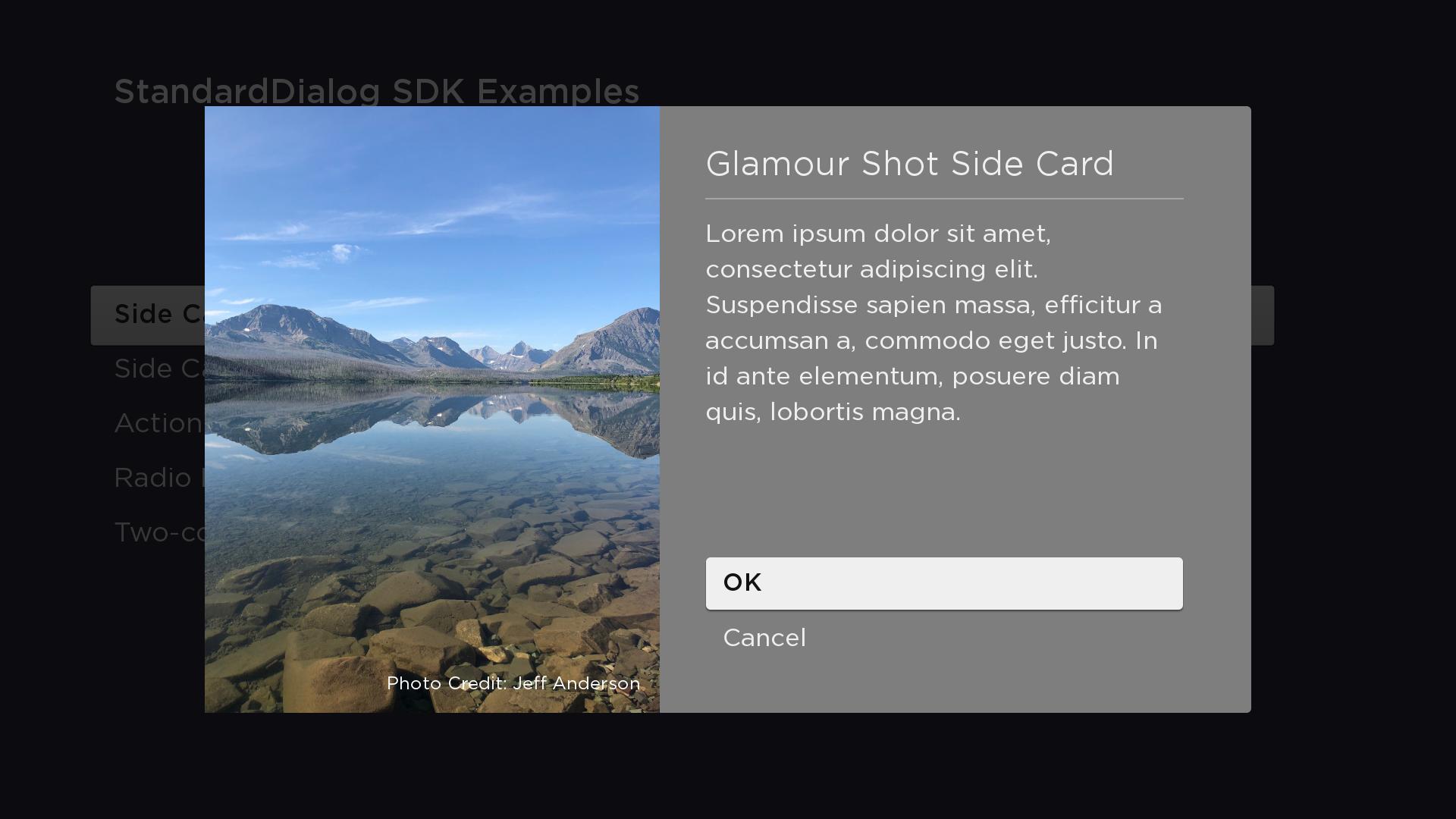
Decorative
In this example, the StdDlgSideCardArea has a child Poster node with its uri field set to the URI of a mountain lake image. The height of the dialog is computed to equal the height of the mountain lake image [800 (FHD), 300 (HD)]. The mountain lake Poster node has a child SimpleLabel node positioned at 575, 775 to show the "PhotoCredit:Jeff Anderson" text on top of the Poster.
<?xml version="1.0" encoding="utf-8" ?>
<component name="SideCardGlamourShotDialog" extends="StandardDialog" initialFocus="buttonArea">
<script type="text/brightscript">
<![CDATA[
function init()
m.top.width = "1380"
m.buttonArea = m.top.findNode("buttonArea")
m.top.observeFieldScoped("buttonFocused", "printFocusButton")
m.top.observeFieldScoped("buttonSelected", "printSelectedButtonAndClose")
m.top.observeFieldScoped("wasClosed", "wasClosedChanged")
end function
sub printFocusButton()
print "m.buttonArea button "; m.buttonArea.getChild(m.top.buttonFocused).text; " focused"
end sub
sub printSelectedButtonAndClose()
print "m.buttonArea button "; m.buttonArea.getChild(m.top.buttonSelected).text; " selected"
m.top.close = true
end sub
sub wasClosedChanged()
print "SideCardRightDialog Closed"
end sub
]]>
</script>
<children>
<StdDlgTitleArea primaryTitle="Glamour Shot Side Card" />
<StdDlgContentArea>
<StdDlgTextItem text="Lorem ipsum dolor sit amet, consectetur adipiscing elit. Suspendisse sapien massa, efficitur a accumsan a, commodo eget justo. In id ante elementum, posuere diam quis, lobortis magna." />
</StdDlgContentArea>
<StdDlgButtonArea id="buttonArea">
<StdDlgButton text="OK" />
<StdDlgButton text="Cancel" />
</StdDlgButtonArea>
<StdDlgSideCardArea id="buttonArea" horizAlign="left" extendToDialogEdge="true" showDivider="false">
<Poster id="sideCardPoster" loadSync="true" loadDisplayMode="limitSize" uri="pkg:/images/MountainLakeSideCard.jpg" translation="[0.0f, 0.0f]" />
<SimpleLabel text="Photo Credit: Jeff Anderson" vertOrigin="bottom" horizOrigin="right" translation="[575, 775]" color="0xFFFFFFFF" fontUri="font:SystemFontFile" fontSize="24" />
</StdDlgSideCardArea>
</children>
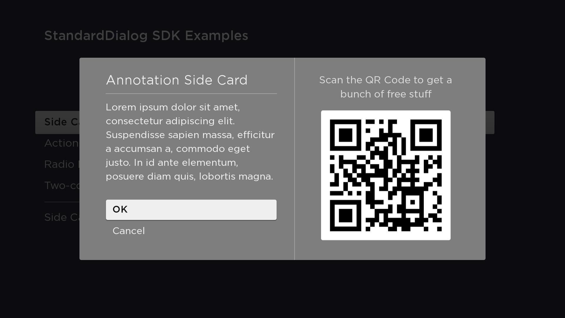
</component>Annotative
In this example, the StdDlgSideCardArea has a child Label node ("Show the QR Code...") and a child Poster node to show the QR code below the Label. The height of the dialog is set to the maximum height of the bounding rectangle of the StdDlgSideCardArea and the vertical column that contains the dialog's child StdDlgAreaBase nodes (TitleArea, StdDlgContentArea(s), and/or StdDlgButtonArea). In this case, the StdDlgSideCardArea is slightly taller; therefore, it's height is used.
<component name="SideCardAnnotationDialog" extends="StandardDialog" initialFocus="buttonArea">
  <script type="text/brightscript">
    <![CDATA[
      function init()
        m.top.width = "1380"
        m.buttonArea = m.top.findNode("buttonArea")
        m.top.observeFieldScoped("buttonFocused", "printFocusButton")
        m.top.observeFieldScoped("buttonSelected", "printSelectedButtonAndClose")
        m.top.observeFieldScoped("wasClosed", "wasClosedChanged")
      end function

      sub printFocusButton()
        print "m.buttonArea button "; m.buttonArea.getChild(m.top.buttonFocused).text; " focused"
      end sub

      sub printSelectedButtonAndClose()
        print "m.buttonArea button "; m.buttonArea.getChild(m.top.buttonSelected).text; " selected"
        m.top.close = true
      end sub

      sub wasClosedChanged()
        print "SideCardRightDialog Closed"
      end sub
    ]]>
  </script>

  <children>
    <StdDlgTitleArea primaryTitle="Annotation Side Card" />
    <StdDlgContentArea>
      <StdDlgTextItem text="Lorem ipsum dolor sit amet, consectetur adipiscing elit. Suspendisse sapien massa, efficitur a accumsan a, commodo eget justo. In id ante elementum, posuere diam quis, lobortis magna." />
    </StdDlgContentArea>
    <StdDlgButtonArea id="buttonArea">
      <StdDlgButton text="OK" />
      <StdDlgButton text="Cancel" />
    </StdDlgButtonArea>
    <StdDlgSideCardArea id="buttonArea" horizAlign="right" width="500" extendToDialogEdge="false" showDivider="true">
      <Label text="Scan the QR Code to get a bunch of free stuff" horizAlign="center" wrap="true" width="500" translation="[0, 0]" fontUri="font:SystemFontFile" fontSize="36" />
      <Poster translation="[30, 120]" uri="pkg:/images/RokuQRCode441x441.png" />
    </StdDlgSideCardArea>
  </children>
</component>
Sample app
You can download and install a sample app that demonstrates how to create a custom dialog that includes a sidecard area.
Updated 2 months ago