
StdDlgKeyboardItem
Content-area item that displays a keyboard or PINpad in a dialog
Extends StdDlgItemBase
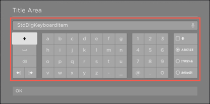
The StdDlgKeyboardItem node is used to display a keyboard or PINpad in the dialog's content area. It provides text and voice entry of strings containing alphanumeric characters and symbols or numeric digits. It should only be used as a child of a StdDlgContentArea node.
Fields
| Field | Type | Default | Access Permission | Description |
|---|---|---|---|---|
| keyLayout | string | "unspecified" | READ_WRITE | Specifies the type of keyboard to be displayed:
|
| text | string | "" | READ_WRITE | The default string to be displayed in the keyboard's text edit box. When the user enters the text, this field is updated with the currently entered string. |
| textEditBox | VoiceTextEditBox node | The VoiceTextEditBox associated with the keyboard | READ | The internal VoiceTextEditBox node used by this dialog's internal keyboard. This field should be used only to access the fields of this internal node. |
Sample app
You can download and install a sample app that demonstrates how to create a custom keyboard dialog that uses the keyboard item.
Updated 2 months ago
Did this page help you?