
StdDlgMultiStyleTextItem
Text item node supporting multiple font styles in a custom dialog
Extends StdDlgItemBase
Description
The StdDlgMultiStyleTextItem node enables developers to add a line of text with multiple styles to the content area of a custom dialog. A multi-style text item may include, for example, plain and bold characters, different fonts, multiple colors, and/or emojis.
-
The drawingStyles field contains one or more associative arrays that represent font styles. Each font style contains fontSize, fontUri, and color properties.
-
The text field uses a simple markup style. Markup tags with the names of the styles defined in the drawingStyles field are used to delineate the boundaries of the label text to be rendered in that specific style.
msTextItem.drawingStyles = {
"default": {
"fontSize": {fhd:33,hd:22}
"fontUri": "font:SystemFontFile"
"color": "#EFEFEFFF"
}
"url": {
"fontSize": {fhd:33,hd:22}
"fontUri": "font:SystemFontFile"
"color": "#00FF00FF"
}
}
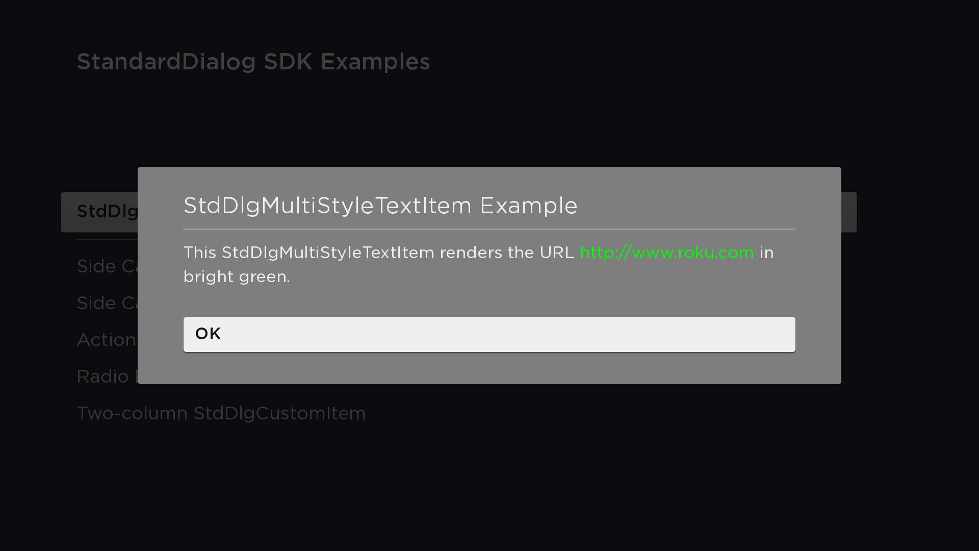
msTextItem.text = "This StdDlgMultiStyleTextItem renders the URL <url>http://www.roku.com</url> in bright green."Fields
| Field | Type | Default | Access Permission | Description |
|---|---|---|---|---|
| text | string | "" | READ_WRITE | Specifies the text to be displayed |
| drawingStyles | associative array of associative arrays | READ_WRITE | Defines the size, URI, and color of a font style. This field may contain one or more font styles. | |
| audioGuideText | string | "" | READ_WRITE | Specifies the string to be spoken when the screen reader reads the text item. By default, the screen reader reads the string specified in the text field. |
Example
In this example, two drawing styles named "default" and "url" have been defined and assigned to the drawingStyles field of the StdDlgMultiStyleTextItem node. The roku.com URL is enclosed in <url> tags, which renders the text with the "url" style defined in the drawingStyles field. The parts of the string that are not enclosed in the <url> tags use the "default" drawing style. If no "default" drawingStyle had been defined, the system default drawing style would have been used.
<?xml version="1.0" encoding="utf-8" ?>
<component name="MultiStyleTextItemDialog" extends="StandardDialog" initialFocus="buttonArea">
  <script type="text/brightscript">
    <![CDATA[
      function init()
        m.top.width = { fhd: 1380, hd: 920 }
        msTextItem = m.top.findNode("msTextItem")
        msTextItem.drawingStyles = {
          "default": {
            "fontSize": { fhd: 33, hd: 22 }
            "fontUri": "font:SystemFontFile"
            "color": "#EFEFEFFF"
          }
          "url": {
            "fontSize": { fhd: 33, hd: 22 }
            "fontUri": "font:SystemFontFile"
            "color": "#00FF00FF"
          }
        }
        msTextItem.text = "This StdDlgMultiStyleTextItem renders the URL <url>http://www.roku.com</url> in bright green."
      end function

      sub printSelectedButtonAndClose()
        print "m.buttonArea button "; m.buttonArea.getChild(m.top.buttonSelected).text; " selected"
        m.top.close = true
      end sub
    ]]>
  </script>

  <children>
    <StdDlgTitleArea primaryTitle="StdDlgMultiStyleTextItem Example" />
    <StdDlgContentArea>
      <StdDlgMultiStyleTextItem id="msTextItem" />
    </StdDlgContentArea>
    <StdDlgButtonArea id="buttonArea">
      <StdDlgButton text="OK" />
    </StdDlgButtonArea>
  </children>
</component>
Sample app
You can download and install a sample app that demonstrates how to create a custom dialog that includes a StdDlgMultiStyleTextItem node.
Updated about 2 months ago