
Controlling screen program flow
Structure custom components and manage screen element flow in your app
SceneGraph applications can control the flow of screen elements in the
following ways:
- by responding to user remote control key press events
- by responding to changes in data, including data that configures the
screen elements - by changing the z-order of screen elements
- by changing the parent-child relationships of screen elements
- by creating and deleting screen elements
- by making screen elements invisible and making other screen elements
visible - by placing remote control focus on screen elements that may be
currently off the screen or otherwise not visible
Many of the more complex SceneGraph node classes are designed to
automatically respond to remote control key press events, and configure
themselves in response to data changes.
Structuring your application and screen element components
The SceneGraph API was designed to create components that encapsulate
the appearance, behavior, and data of custom screen elements. These
custom components can then be used in a Scene node program flow that
creates the custom components as needed, in response to user selections,
or changes in data received from and/or sent to a server. These custom
components are analogous to BrightScript components with data interfaces
that render screens and screen elements, such as roPosterScreen; in
fact, the SceneGraph PosterGrid node
class is itself very similar to the BrightScript component
roPosterScreen. But by using the SceneGraph API, you can combine several
node classes into a custom component with its own encapsulated behavior
in response to user input and data received from your server.
As an example, for typical VOD applications, the following should drive
the development of your custom SceneGraph components, and the program
flow in the Scene node that displays these components as needed:
- your current video content catalog database
- the data requirements of allowing users to rent or purchase video
items - the visual elements you choose to allow users to select video items
Creating custom components
To continue with a VOD application example, a typical VOD application
will first offer a set of video content categories for user selection,
such as "New Releases", "Drama", "Comedy", and so forth. This should
drive the development of a SceneGraph custom component that displays
these categories, which will read the data from your server that you
make available to the component to display the categories, including
icons, text, graphic images, in either JSON or XML format. The data
provided for that component should also include data to pass to another
custom component, through the
<interface> element or other means, to
allow user selection of further sub-categories or video content items.
All of the previous BrightScript component "screens", including
"screens" for registration, search, license display, can be developed as
encapsulated SceneGraph components, which can (and typically will and
should) include their own components developed to provide specific
appearance and functionality to several major components in your
application.
The deciding factor to develop a custom component is whether it serves a
discrete user interface purpose to display certain types of data to the
user, and react to user selections and input related to the data. Again,
as an example, the first component you might typically develop for a VOD
application would be the first menu of video categories. As a user
interface design choice, you may have decided to use a vertical list of
text strings ("New Releases", "Drama", and so forth), each with a small
icon representing each category to the left, and a larger poster graphic
image to the right of an example video chosen at random to represent the
category (for example, a poster image for the movie Argo for the
"Drama" category). On your server, you must make available a JSON or XML
file containing the necessary data and links to data and graphic images
that you have written from your content catalog database to support the
data needs of the component. The component itself will consist of the
ability to access the required data, and the selected node classes and
component behavior to display the data according your user interface
design for that screen element.
This is how you might want the list to appear and behave, with the
category poster appearing along with a red underline cursor under the
focused
item:
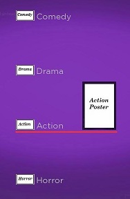
For the VOD category list example, the first step might be to write a
SceneGraph component outline similar to the following:
<component name = "VODCategoriesList" extends = "MarkupList">

</component>
You can then select the nodes to comprise your custom component from the
SceneGraph API node classes, to either create or modify them using
BrightScript in the <script> element, and/or declare/define them
in XML markup in the <children> element. For example, for a list
of categories, you might want to use the
LabelList node class, or perhaps the
MarkupList node class, since you intend
to include graphic images as part of your list. You will also use two
Poster node classes somewhere in your
component for your icon and poster graphic images, perhaps as part of
another custom component that is the definition of the
itemComponentName field of the MarkupList node. You complete the
component by adding <interface> element fields as needed to get
and set data that is either needed for the component, or passed to other
components and/or the Scene node BrightScript program flow.
For the example VOD categories list, we should use a MarkupList
node, because we want to use custom graphic images as part of each list
item. So we need to start work on a custom item component for the
MarkupList node itemComponentName field. This custom item
component is where we will define the individual sub-elements that make
up this screen element component, their SceneGraph node type and
position, size, and other attributes, and how they will appear as focus
moves from item to item. So we start with the following
outline:
MarkupList item component outline
<component name="VODCategoriesListItem" extends="Group">
  <interface>
    <field id="itemContent" type="node" onChange="showcontent" />
    <field id="focusPercent" type="float" onChange="showfocus" />
  </interface>

  <script type="text/brightscript">
    <![CDATA[
      sub init()
        m.itemicon = m.top.findNode("itemicon")
        m.itemlabel = m.top.findNode("itemLabel")
        m.itemcursor = m.top.findNode("itemcursor")
        m.itemposter = m.top.findNode("itemPoster")
      end sub

      sub showcontent()
        itemcontent = m.top.itemContent
        m.itemicon.uri = itemcontent.url
        m.itemlabel.text = itemcontent.title
        m.itemposter.uri = itemcontent.HDPosterUrl
      end sub
    ]]>
  </script>

  <children>
    <Group>
      <Poster id="itemicon" />
      <Label id="itemLabel" />
      <Rectangle id="itemcursor" />
      <Poster id="itemPoster" />
    </Group>
  </children>
</component>
The outline includes the Poster nodes we will use for graphic
images, a Label node for the item string, and a Rectangle node
we will use as a cursor to indicate focus on the item. It also includes
the <interface> itemContent field to set the Poster node
URIs, and the text string for the Label node, with the
showcontent() function in the <script> element setting the
required fields for those nodes when the MarkupList node creates
each instance of the item component.
To complete this component, you would need to specify the local
coordinate locations of each of the renderable <children> nodes
according to the design of the user interface, and any other behavior
you want for each list item, such as when it becomes focused and/or
unfocused. For this design, we want only the text of each item and the
corresponding icon to be visible when the item is unfocused, and make
the cursor appear below the item, and the corresponding poster appear to
the right, when the item is focused. So, for example, we set the
itemPoster sub-element in position in the item definition with an
initial opacity field setting of 0.0 to make it invisible until
focused:
<Poster
  id="itemPoster"
  width="98"
  height="140"
  opacity="0.0"
  translation="[ 192, 4 ]" />
Then we can write the <script> element callback function
showfocus() to indicate focus when the focusPercent
<interface> field changes:
sub showfocus()
  m.itemcursor.opacity = m.top.focusPercent
  m.itemposter.opacity = m.top.focusPercent
end sub
Then you assign your item component to the itemComponentName field for
your MarkupList node component, as part of completely defining your
custom category
list:
MarkupList custom component outline
<component name = "VODCategoriesList" extends = "MarkupList" >
  <script type="text/brightscript" >
    <![CDATA[

    sub init()
      m.top.itemComponentName = "VODCategoriesListItem"
      m.top.itemSize = [ 294, 148 ]
      m.top.itemSpacing = [ 0, 10 ]
      m.top.drawFocusFeedback = false
      m.top.vertFocusAnimationStyle = "floatingFocus"
    end sub

    ]]>
  </script>

</component>
MarkupList is an example
application of the completed custom list configuration. In the example
application, note that the file markuplistcontent.xml is the
ContentNode component that supplies the data to populate the
list; normally this data would be in a XML/JSON file that would be
downloaded from your server to the application and converted to a
ContentNode using a Task node (or equivalent). Also note
that the icon and poster files are included in the package images
directory, rather than your server, and the markuplistscene.xml is
only provided to allow the example to run as a standalone application.
Once you have developed the custom components, you can write a program
flow in the Scene node to create/remove, make visible/invisible, and
set the remote control key focus on the custom components as needed.
Custom component program flow examples
For an example application that uses three custom components, and
creates and sets focus on the custom components as needed in reaction to
user input in an OverhangPanelSetScene node, see Sliding panels
example.
There are two more examples that allow users to select and play videos
from a custom RowList node:
These examples download and convert a MRSS XML feed containing all the
data for the application to a ContentNode field added to the
Scene node <interface> element. In this case, the data for the
application is downloaded and converted in the source/main.brs file
after the application Scene node is created but before it is shown,
rather than using a Task node in the actual SceneGraph application.
Updated 4 months ago