
StdDlgItemGroup
Groups StdDlgItemBase child nodes and manages radiobutton selection
Extends StdDlgItemBase
The StdDlgItemGroup node is used to visually group a set of StdDlgAreaBase child nodes in a custom dialog. Developers can use this node to reduce the vertical spacing between the StdDlgItemBase child nodes. For StdDlgActionCardItem nodes, the StdDlgItemGroup node enforces the rule that when multiple items StdDlgActionCardItem nodes have their iconType field set to "radiobutton", only one may have its selected status be set to "true".
The StdDlgItemGroup node may contain one or more StdDlgItemBase child nodes (for example, StdDlgTextItem, StdDlgGraphicItem, and so on) as its children. It will visually group those child StdDlgItemBase nodes by reducing the amount of vertical space between them. However, the primary benefit of the StdDlgItemGroup node is managing StdDlgActionCardItem child nodes that have their iconType field set to "radiobutton".
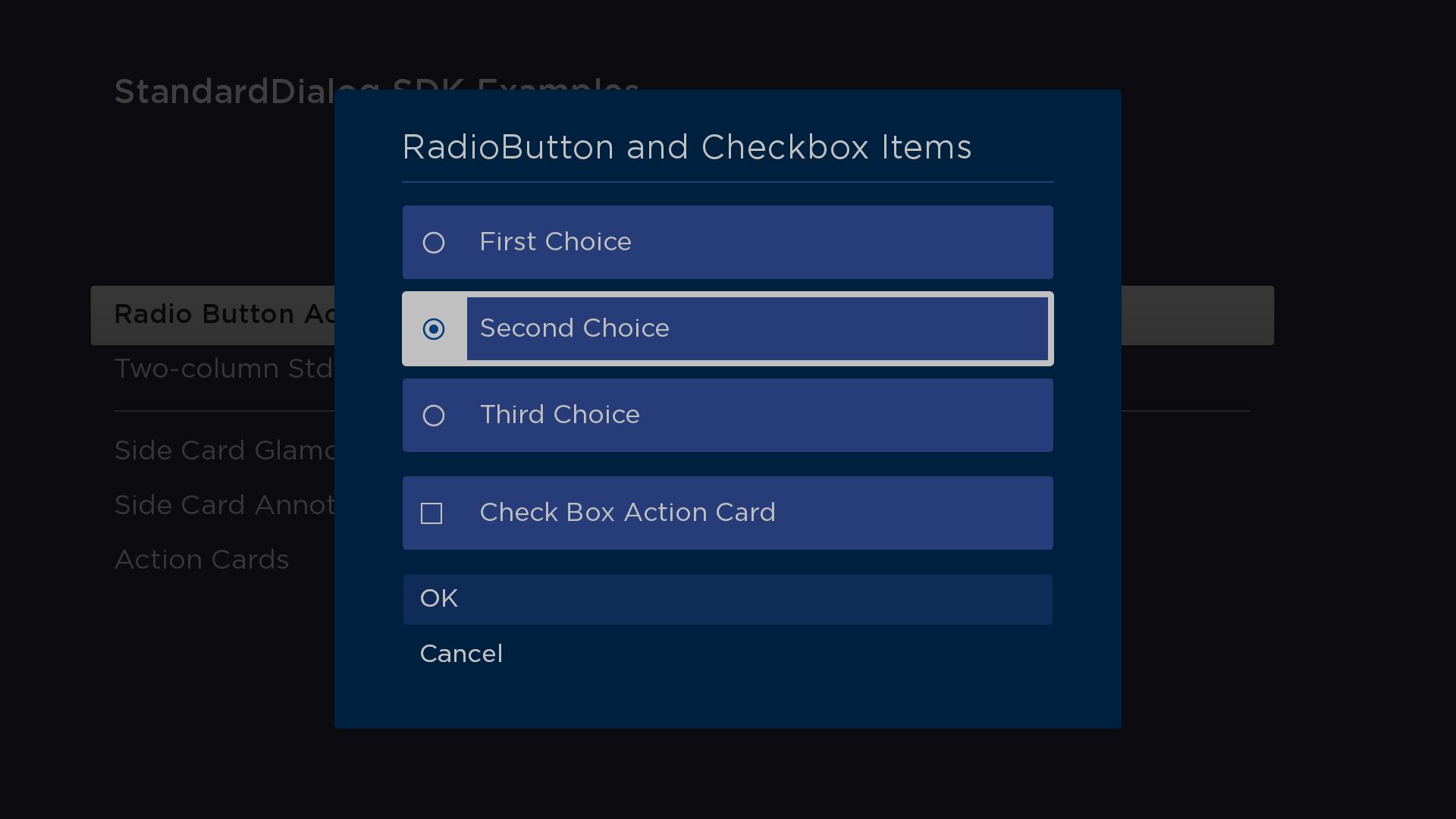
See the stdDlgActionCardItem documentation for code demonstarting how to use the StdDlgItemGroup node in a custom dialog.
Fields
| Field | Type | Default | Access Permission | Description |
|---|---|---|---|---|
| selectedIndex | integer | 0 | READ_WRITE | The index of the currently selected StdDlgAreaBase child node. This field is updated when the user selects any of the StdDlgActionCardItem child nodes. This field can also be updated via BrightScript to change which child node in the StdDlgItemGroup is selected. When this field is updated and it corresponds to a StdDlgActionCardItem node that has its iconType field set to "radiobutton", the StdDlgItemGroup node enforces the "only 1 of n" rule for radio buttons by setting the iconStatus field of the other radio button action card items to "false". |
Sample app
You can download and install a sample app that demonstrates how to create a custom dialog that includes action card items in an item group.
Updated 2 months ago